Description
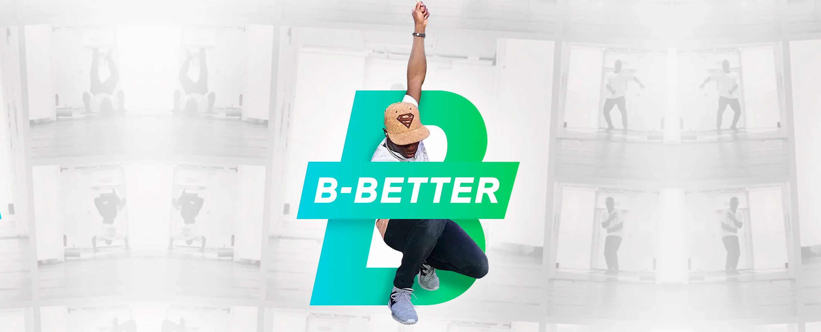
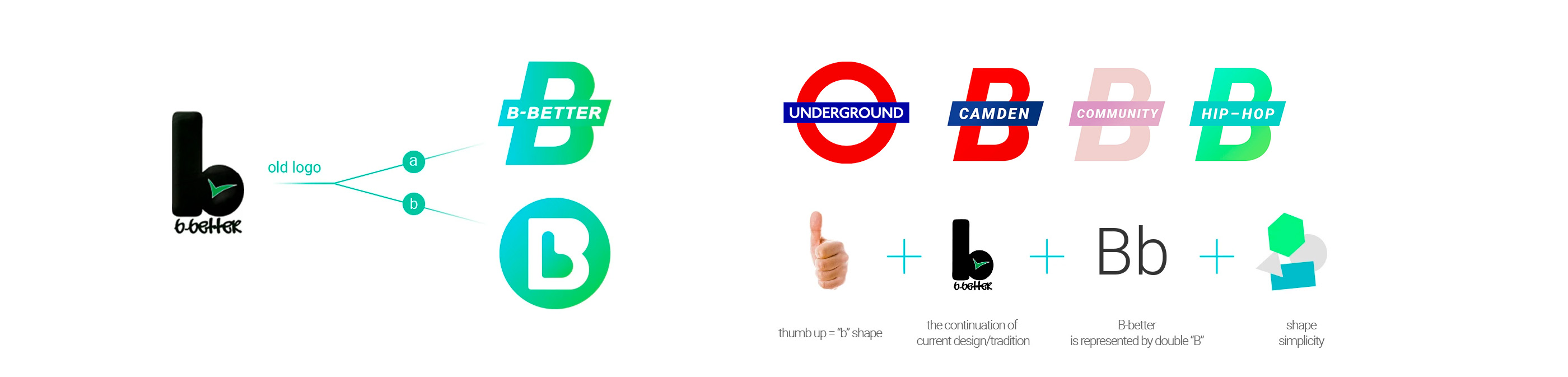
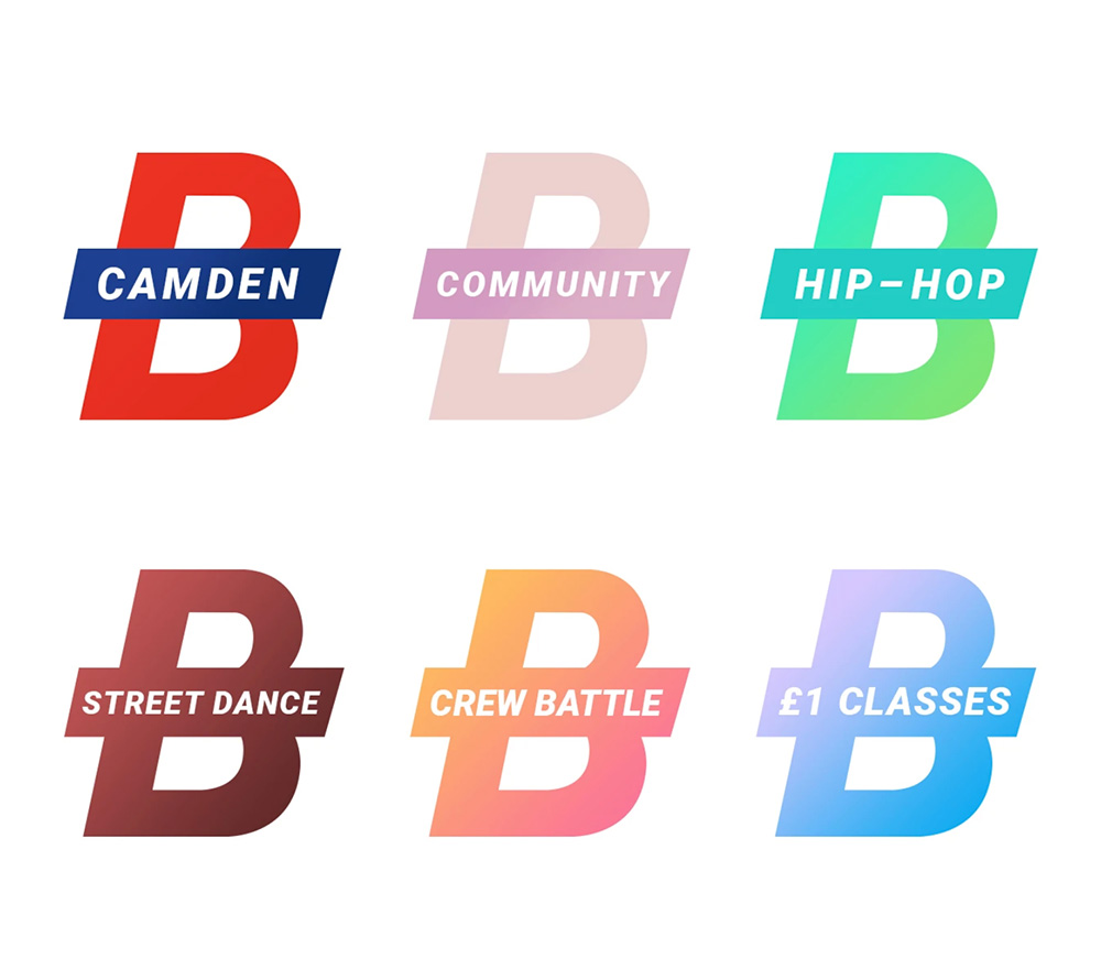
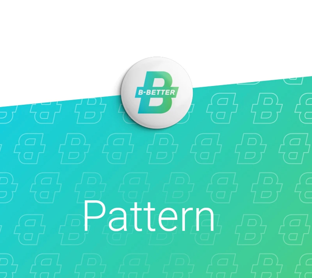
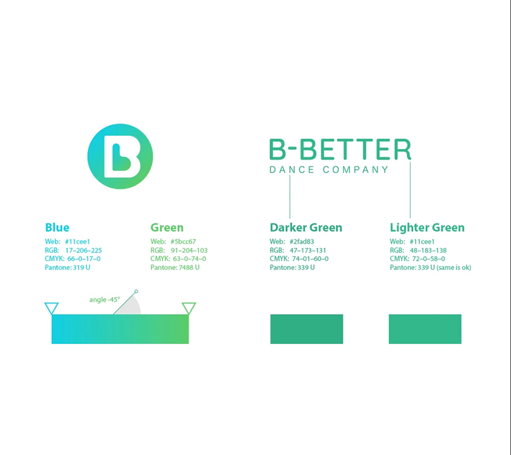
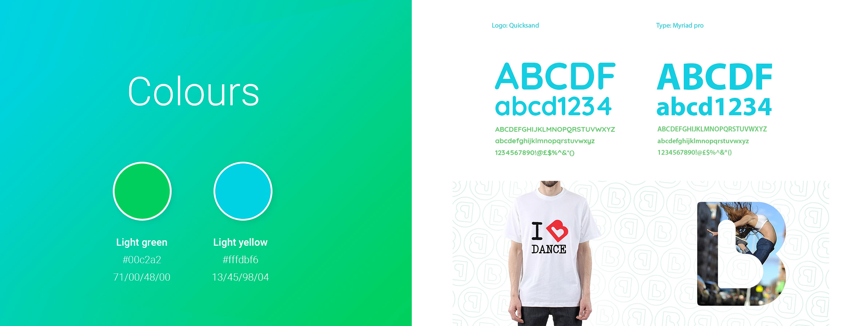
My aim was to express the joy out of dancing and bring a sense of movement to the logo. We came up with two options: in the option A we achieved this through the “B” repetition in the name that visually supports the reading experience and works also as a pictogram itself. In the option B we played with layers and readability of letters. In both options, we used the same colour palette that is based on green and blue. I thought the ideal way to express motion was through gradient between those colours which now unifies the whole visual style across other materials.
Project scope
Complete branding. All visuals in digital and print form.
Location
London - Camden